Drain Power @ The Biondo Group
It’s easy to be dismissive when looking at design packaging design work that was done in the nascent days of packaged goods marketing. Looking at graphics done in an earlier era, it’s easy to ding them for being too simple, too basic in design and lacking a general understanding of design architecture. Viewed as quaint given our sophisticated visual palettes, but in their day, in that context – they were seen as innovative.
Working with a firm that has deep roots in packaging design, you are bound to see older work and hear stories that describe the development of these hallmark products. Listen carefully and you are likely to hear a story that is relevant, even for today’s package goods designers and marketers.
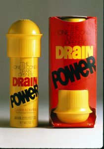
House cleaning is what brought this project: Drain Power, to light after years of being archived. Weeding out older work to make room for new work is what caused this award-winning package, for an innovative product (for the time) Drain Power to come to our attention.
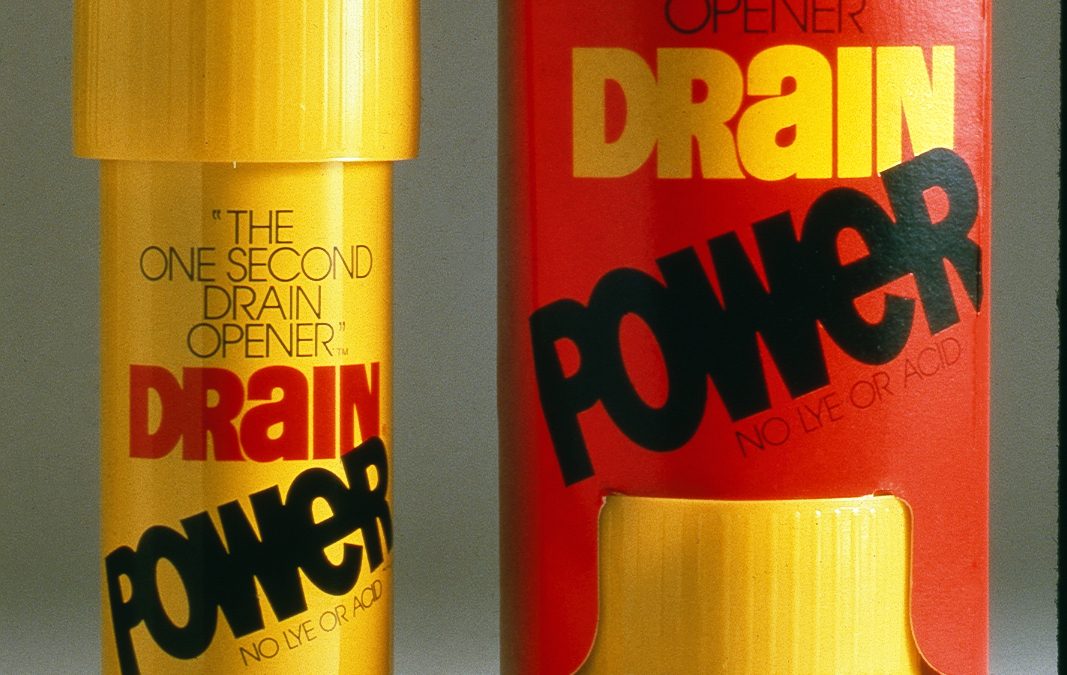
In our hyper-visual culture, it’s not often that you see a product package that is entirely graphic, leveraging only fonts and basic colors. As soon as we took a look at the older design, we got sucked in to the project, and found ourselves going through all of the project paperwork before we archived it for good.
The story goes that, the Lever Corporation selected the Biondo Group to help them develop a packaging design solution for a new aerosol powered drain-declogger, called Drain Power. The product was innovative – a completely new type of product, using compressed gas as the cleaning force, rather than the more common caustic chemical treatments.
How best to tell the story and describe the product usage was tricky.
Lever was in uncharted waters because this was something really new. Some brainstorming and sketching resulted in a unique shelf friendly display. Due to the new aerosol delivery system, engineers were enlisted by the can manufacturer to work with us on the products usage, style and overall appearance.
A secondary outer carton held the product “upside down” in the position of intended usage – an innovation and a standout graphic strategy. As anyone with structural design experience will attest, making sure that the carton holds the product, is stackable, strong and cost effective is no mean feat, taking a lot of work. In this case the Biondo design team worked with the paperboard converter to make sure that all of the visual and design criteria were met – while still delivering a safe and economical package.
Clear, clean and bold typography (hand lettered as was the process in that era) made sure that typographically the message was looking good and balanced. Extensive qualitative testing with both the consumers as well as the plumbing trade was conducted on the product, its delivery system, the package structure as well as the graphic concepts.
The final product package reflects the effort and thought that went into developing the system and not surprisingly – the product was a success. The results were so positive that the Product manager at the time shared with us that: “in Boise Idaho, we’ve had orders for more Drain Power than there are drains…..”.
The takeaway was that the best solutions still come from teamwork and getting smart people collaborating towards a common, well defined and agreed to goal. It was also clear in reviewing all of the project’s files that the client had the time and resources to dedicate to develop something new and “out of the box”. All the ingredients were in place for a successful launch and Drain Power was a winner out of the gate.
-sb

