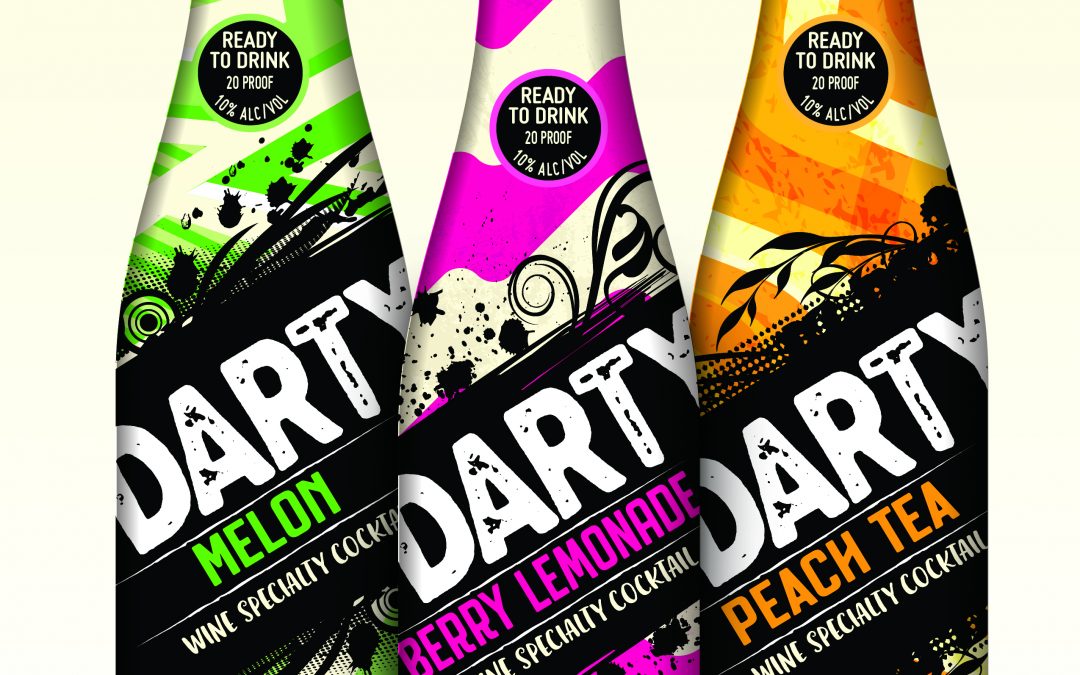
DARTY – a fresh look for a new beverage brand
Harvest Hill (Stamford, CT) chose to work with the Biondo Group when it came to design the packaging graphics system for a new line of branded beverages. The brand is DARTY, and it is targeted to consumers – 21+. The packaging’s appearance references the “fun and...
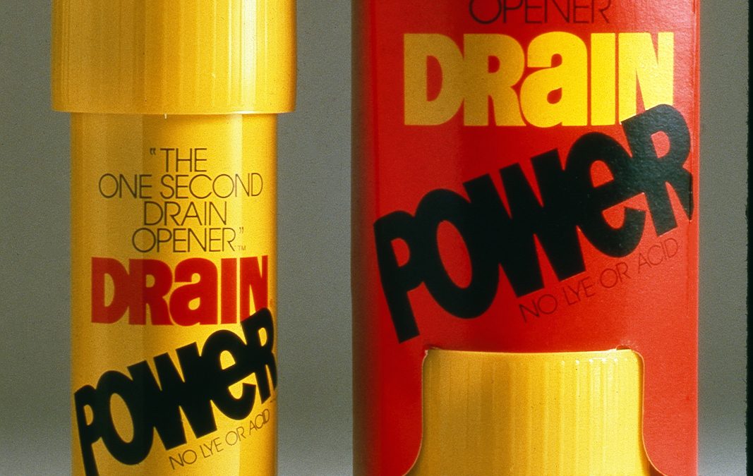
Drain Power: a Biondo Group look back
It’s easy to be dismissive when looking at design packaging design work that was done in the nascent days of packaged goods marketing. Looking at graphics done in an earlier era, it’s easy to ding them for being too simple, too basic in design and lacking a general...

10 Minutes with Charlie
Spend time around Charles Biondo and you are going to hear a design story or two. For the most part they are centered on the topic of Packaging Design. Admitting freely that “my life is my business” one can appreciate how much time and effort he has dedicated to the...
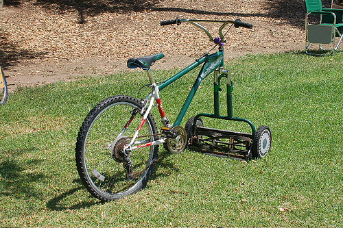
Re-tooling the design firm and client relationship
Unlike advertising agencies, design firms’ work on a per-project basis with clients. Projects are the bread and butter of design companies. Early on in the heyday of packaging design, it was common that a single design firm worked on a single brand over-time, and so...
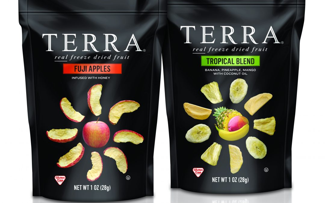
Biondo Group recognized @ the GDUSA American Package Design Awards
The Biondo Group recently received three GDUSA American Package Design Awards. The three awards recognize distinct design solutions for The Hain Celestial Group, Inc.The first award is for a new subline from the Terra Chip line called Terra Real Freeze Dried Fruit....

Does package design need to adapt to e-tailing environments?
With an increasing number of packaged goods being sold through and adapted for online channels we ask ourselves on a pretty regular basis - has the nature of a package’s design and communication requirements changed? To answer the question – yes, communication...

Design is an investment, not an expense.
In a perfect world Design would be viewed as an investment and not an expense. Design, at its core is about change. Change is a little messy, time consuming, pricey and often the cause of discomfort – for consumer, brand and bottom line. So what compels brands to...
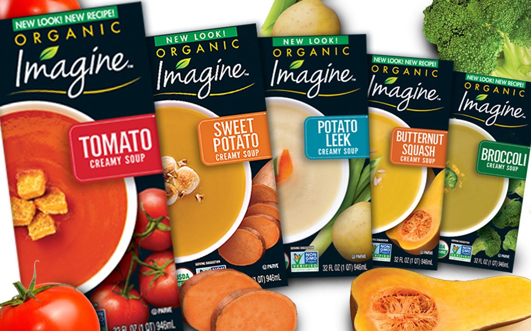
Imagine Creamy Soups: packaging design
Packaging Design Objectives: The design team was challenged to develop a strong primary panel presentation for the Creamy Soup line – that would appeal to the “health conscious” and flavor oriented shopper. Tags: Brand Identity, branding, consumer product...
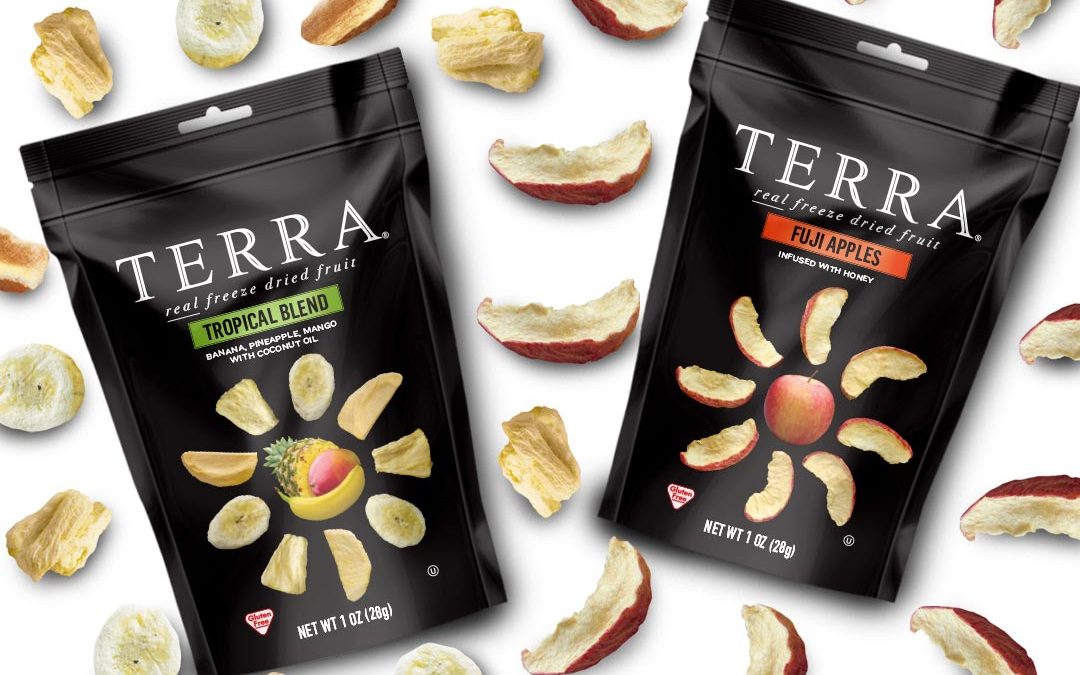
TERRA Freeze Dried Real Fruit: packaging design system
The Biondo Design team was tasked with developing a packaging design system that would establish TERRA Freeze Dried Real Fruit as a quality subline of the TERRA brand. Leveraging existing brand equities, we successfully developed a look that visually differentiated...
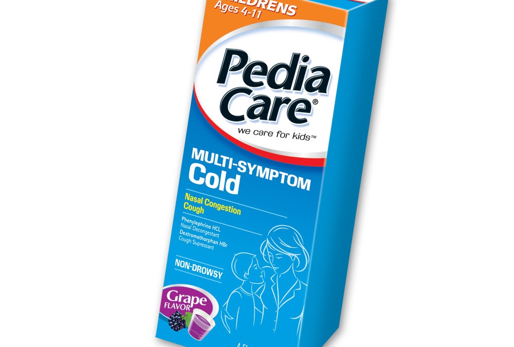
PediaCare: brandmark & packaging design
The Biondo Design team refined the PediaCare brand-mark and created a strong, unified branding system with strong differentiation of segments and varieties, additionally we designed a set of symptom icons. We extended the concept to 5 distinctive segment looks and...
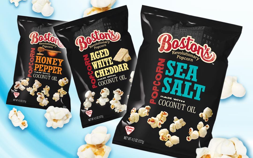
Boston’s Popcorn: packaging graphics redesign
Design Objectives Reinvigorate the Boston’s Popcorn brand with a new look and feel Modernize the look of the brand while maintaining a connection to the old world/traditional heritage of the brand Establish Coconut Oil Popcorn as a subline of the Boston’s brand while...
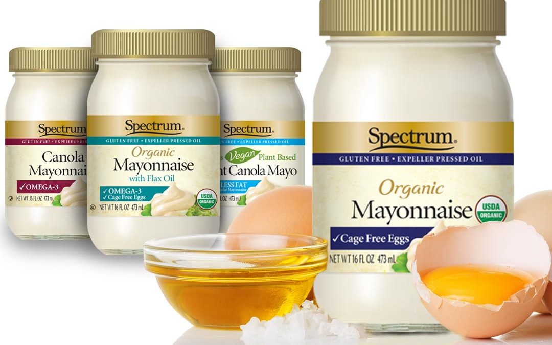
Spectrum Organic Mayonnaise: packaging design & line extensions
Spectrum Organic Mayonnaise brand management asked our design team to explore two- packaging design and line extension strategies, requiring that both be cohesive to Spectrum Organic branding. The Biondo Group design team was asked to consider specific criteria when...
