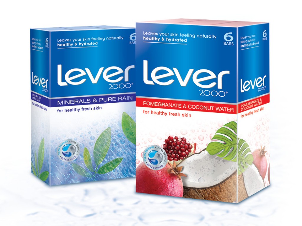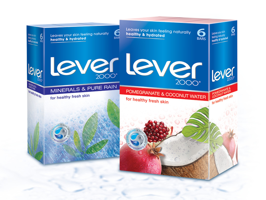
Lever 2000: brand refreshment, packaging archhitecture, packaging graphics
Objective
Our client allowed the Biondo Design team to test the limits of what the brand could do from a graphic communications standpoint.
- The Lever 2000 Marketing team was clear:
- Reposition brand to appeal to a new target consumer – active, young boomers – men and women 45-60
- Contemporize the brand and clearly communicate the brand essence – Health Fresh Skin
- Nothing was sacred – everything was up for grabs
- Looking for vibrant colors
- Can look at consistent color for all skus with accents to differentiate sku’s
- ALL DESIGNS had to be a WOW
- Needs to stop people going down the aisle and make them pick it up
- Push the graphics
Tags: Brand Identity, branding, consumer product marketing,containers, design, packaged goods marketing, packaging, packaging design, point-of-sale, POS, artwork, production, strategy, supermarket shelf, The Biondo Group, HBA, food packaging
