

When someone says structure, what comes to mind?
For many, the word structure conjures imagery of XLS tables and MS Word docs. This sort of structure provides the framework for the tasks, jobs and interactions we have during our day, helping hold it all together, giving us rules of engagement, reference points, and markers that allows us to lead modern lives.
In a packaging design context, the word Structure, although different than the above application and description, does indeed hold it all together. Structure in this context is the container that holds a product, or “good”, for use or for sale.
In other words, a Structure is a container; dispenser, can, pouch, bag or bottle that holds a product.
In a consumer product context, the container structure must satisfy some basic requirements and functions. It has to safely hold the product, in a way that allows it to be transported and dispensed. It has to meet some basic, yet very important engineering requirements.
Engineering you might ask? Imagine, if a bottle container wasn’t up to specific engineering and technical material standards. If not up to a predefined “spec”, it could lead to leaking or stacked palettes of product collapsing in warehouses, or during shipment, in a word, disaster.
So from one perspective a container structure has to work and be safe. The structure has to be able to hold the product through manufacturing, warehousing, shipping, use and storage, and that doesn’t happen by accident. Not only has the structure got to be “sound” it also has to look great, and in context of the products surrounding it.
For a consumer packaged good, the supermarket is a tough crowded hyper-competitive place. Our clients are always on the lookout for new ways of differentiating and enhancing shelf side communications. One of the best ways of differentiating your product at POS is through the use of a proprietary or unusual container structure.
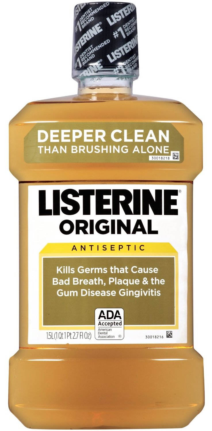
Log Cabin syrup, Mrs. Butterworth syrup, Krazy Glue, Listerine, Scope, Quaker State, are just a few of the brands that have leveraged the power of tactile differentiation by using unique container structures. Pick one of these brands up and you KNOW what you’ve got in your hands, even if your eyes are closed.
Yes, the packaging costs are higher in the near term due to mold costs and the necessary modification of production machinery, but eventually, they too are amortized and when the dust settles, the brand is left with a distinguished packaging presentation that stands proudly at shelf and easily differentiates itself from the competitive array.
Structure, it is not just for organizing your day!
The Biondo Group
-sb
Tags: Brand Identity, branding, consumer product marketing,containers, design, packaged goods marketing, packaging, packaging design, point-of-sale, POS, artwork, production, strategy, supermarket shelf, The Biondo Group, HBA, food packaging
