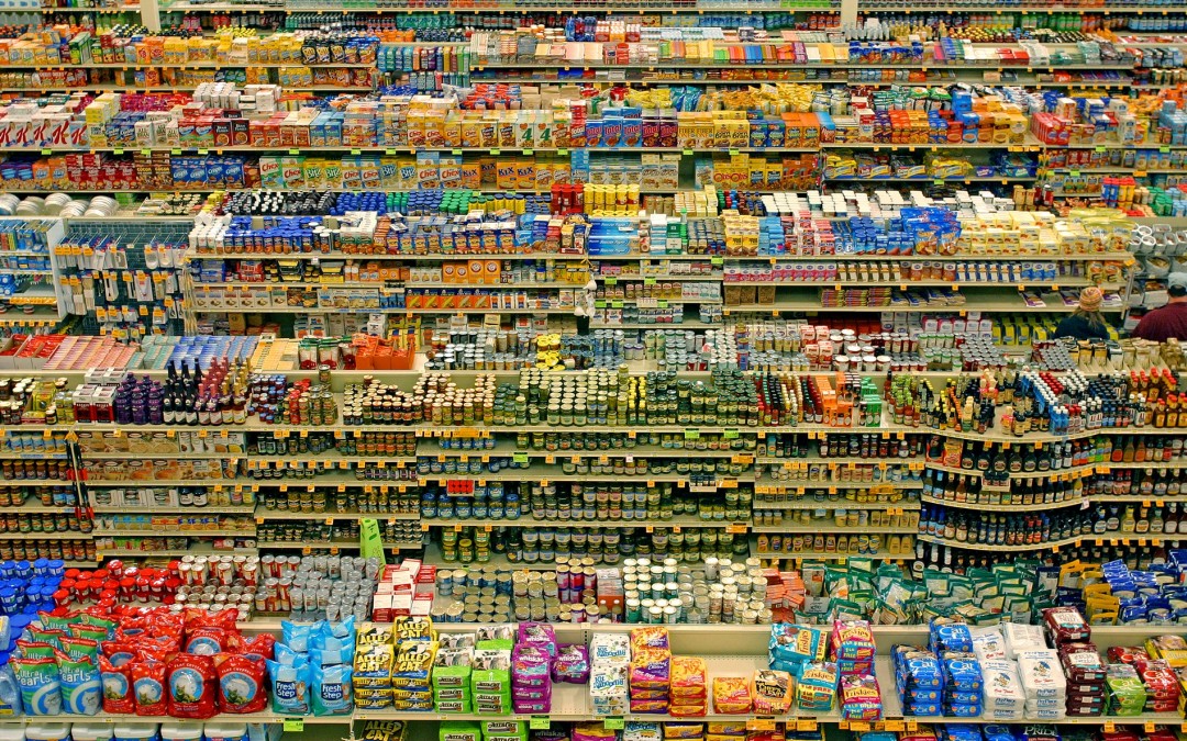
Although packaging design is critically important in terms of connecting with the consumer, the retail environment itself, is one of the, if not the most, important factor in how a product “sells through” at POS.
Supermarkets are a critical part of our nutritional ecosystem, they are the gatekeepers of our food supply. Think on this: the top 30 supermarket grocery chains in the world control nearly thirty-three per cent of all global food sales. In the USA there are more than 37,000 supermarkets with annual revenues in excess of $2 million dollars.
It has been reported (by the FMI) that the average large supermarket contains approximately 42,214 food and beverage products, that number increasing year by year.
And as designers (and this goes for our clients too) it is totally out of our control to manipulate or change the retail environment. The retail environment is what it is and our work has to accommodate. Better yet, our work should leverage the environment in which our client brands find themselves competing.
How do we do that? How do we anticipate what will happen once the product is delivered to a Supermarket? We begin with a deep understanding of the fact that food choices as well as eating behavior depend on the environment, economic and psychosocial variables. We also study analogous retail situations and the decisions retailers have made in the past.
The Reality:
When you see goods on a supermarket shelf, in essence you are looking at a puzzle known as a planogram; a map indicating where retail products should be placed on shelves. This specificity as to exact placement is to insure maximum sales.
Within a shelf set, its been said that “eye level is buy level”, meaning that products positioned at eye level are more apt to sell than those on lower or higher shelves. You’ll notice that many times, more expensive products are merchandised at eye level, while the private label brands are placed on higher or lower shelves. Next time you are in a supermarket, keep track of how many times you need to bend down to get something you want.
The “number of facings”, also has an effect on impact, brand recognizability and sales. The more visible a product or brand, the higher sales are likely to be.
The location of goods within an aisle is also important. There is an old saw, that goods placed at the start of an aisle do not sell well. For those that ascribe to this theory, it is believed that a customer needs time to adjust to the shopping aisle, before they are ready to shop. Clearly, opinions and theories abound.
Designing an effective planogram doesn’t demand that the store merchandise similar goods adjacently; though a number of Supermarkets have found it makes sense to merchandise some goods adjacently, even though they are not in the same product category. Beer and pretzels is but one example.
If you are buying beer, pretzels are probably a consideration, and a little convenience makes a purchase more likely. This idea of placing complementary goods together might seem an obvious choice but it could have an effect on the overall sales of pretzels, especially if the space given to pretzels in other parts of the store is reduced.
And furthermore, what do you do with peanuts and other salty snacks, have them near the beer as well?
To be continued….
* http://www.fmi.org/research-resources/supermarket-facts
-sb

