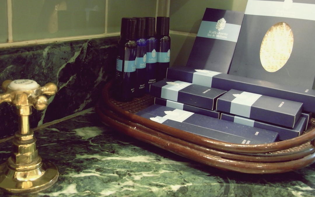
At the Biondo Group, we are of the opinion that Packaging Design is one of the most important marketing channels that a brand marketer can leverage: benefitting themselves, as well as consumers/ users. As packaging and packaging systems designers, this is to be expected, as that’s what we do, optimize the point-of-sale channel for our clients.
Through LinkedIn, we came across this mini-rant. We rarely see a piece of content directly addressing our niche, Packaging Design, and furthermore noticed that there were in excess of 109 comments, and the post had barely been up a full morning.
Clearly, Neil Hunt the author of the article, struck a chord with the LinkedIn business community, many of whom are no doubt travelers who’ve got deep experience with Hotel Amenities/ Toiletries, the focus of this piece.
Hotel shampoo/conditioner/gel: Why does it make sense to make four identical tubes, of the same color, and label them with in tiny letters (all upper case, just to make them as little less readable), in low contrast silver shiny letters – letters that are hard to read even if you do have your glasses on! (And what’s the difference between body scrub and body wash?Presumably, the main purpose of the label is so that the users chooses the right product to use.”
– Shampoo Bottle Design Fail by Neil Hunt CPO @ Netflix
We’d bet that the people at this hotel chain are smart folks, so what gives? What rationale did they have for not designing the packaging for this line of goods? Did the client or manufacturer consider the possibilities and benefits that a properly designed packaging system can provide all parties?
From ease of product selection while in use, to easier product restocking and identification – packaging design has real, functional benefits in the field. Complimentary to those benefits are branding benefits. Each of the amenities that leave in a guest’s luggage are individual brand ambassadors, travelling far and wide to “represent”. Acknowledging the importance of this, many hotel brands are now using better quality product, partnering with quality brands in the niche, and packaging their products more purposefully.
We suspect that the subject of Neil’s article didn’t have a rationale, and that packaging design was not on the agenda when the deal was struck with the manufacturer. We’d suspect that the manufacturer/ packer didn’t give a great deal of thought to packaging design, past conspicuously applying his client’s logo, sized properly, to the specified stock container structure.
““People have more trust in a product that they may be somewhat familiar with,” said Prem Devadas, president of Salamander Hospitality, which owns several hotels. “When you put your (hotels) logo on the bottle, they don’t know what the product is.”
Interestingly, and acknowledging the importance of amenities, many hotel chains have stopped branding these items with their own brand marks, opting to leverage brand names that are familiar and in context for the HBA category, such as L’Occitane, Molton Brown and Bath & Body Works. In support of that, does anyone really want to use “Super 8 Hand Cream”?
In conclusion, it’s well worth figuring out the branding, and design strategy that should be driving the packaging design activity for an Amenities program. Going the extra step, and hiring a Packaging Designer to make sure that your product is, in all regards, presented the best it can be, is a smart move in the long run.
***
-sb

